

Open Source Software Nutrition Labels: Scaling Up with Anaconda Python

Between July and September 2021, we conducted an internal audit of FakeFinder, a deepfake detection tool that our IQT Labs colleagues developed earlier in 2021. This effort yielded several insights and new artifacts, including an Open Source Software Nutrition Label prototype, described in our previous post.
In this post we discuss how we scaled up the concept of Nutrition Labels beyond FakeFinder, using data from Anaconda Individual Edition (Linux/Python 3.9). We also discuss how we added more interactivity — including the ability for users to sort and modify software health-related metrics — to the Open Source Software Nutrition Label template. Finally, we reflect on what we learned about open source software ecosystem assessment and provide links to related work.
Scaling Up Our Nutrition Label Prototype with Anaconda Python Data
After generating a Nutrition Label prototype for FakeFinder, we performed a similar analysis on the Anaconda Package ecosystem, using the same dependency dataset described in “Mapping Anaconda Code Contributors.” In this case, we queried 678 packages in Anaconda Individual Edition for Linux/Python 3.9, obtaining Snyk Advisor, GitHub, and PyPI project metadata results for 556 (or ≈82%) of them.
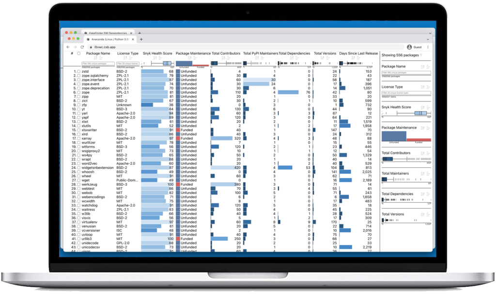
In building the Anaconda Nutrition Label, we included several metrics that were outside of the original scope of the FakeFinder Nutrition Label, including License Type, which is crucial for managing licensing risk. As before, we used a multi-attribute ranking and visualization framework called LineUp.
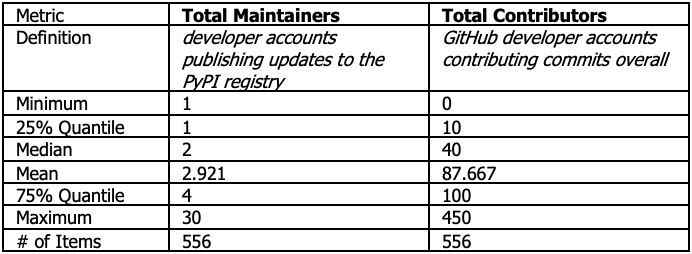
Interestingly, when we added a data column showing Total Maintainers we noticed a stark discrepancy with Total Contributors, summarized in the table below:
Table 1. Comparison of PyPI vs. GitHub Developer Totals in the Anaconda Nutrition Label
N.B. These values may have changed since our initial query in 2021, and we have not set the demo UI to refresh automatically.
While it is difficult to generalize, we believe this pattern in the data (whereby total GitHub contributors generally outnumber total PyPI maintainers) stems from multiple factors:
- The All Contributors movement within open source software, which seeks to “reward each and every contribution, not just code” stored on a package registry like PyPI. We are concerned there will be longer-term ramifications for commercial open source users as this norm becomes more deeply embedded in open source software communities around the world.
- While there are many types of contributions one can make to a source code repository, the primary purpose of a PyPI account is to maintain packages published to the registry.
- Platforms like GitHub do not distinguish between maintainers and contributors. The former are responsible for the project’s direction and, thus, likely responsible for publishing official releases while the latter includes anyone who has committed content to the project.
Given the limitations of the GitHub contributor count metric, one starting point for further analysis could be exploring the relationships between PyPI package maintainer accounts and GitHub contributor accounts in greater depth. We believe this approach could offer additional insight into GitHub contributors who are likely filling a maintenance and community leadership role for a given package.
Visualizing Days Since Last Release (described in Part I of this multi-part blog discussion) for the 556 Python packages included in our Anaconda Nutrition Label also yielded a noteworthy result. Specifically, we found that as of mid-2021, roughly two-thirds, or 356, had undergone a new maintenance release in the past year. This finding is consistent with our GitGeo-based analysis of the top 100 contributors per package to Anaconda, which discovered that “[w]hile the vast majority of packages have had updates within the past year, [many] have not, suggesting that useful open source data science packages don’t always have active ongoing development.”
Adding Interactivity and Derivative Metrics
In developing our new Open Source Software Nutrition Label prototypes, we gathered feedback from a wide variety of potential users. Among these were colleagues and U.S. government software supply chain risk managers, who repeatedly asked for the ability to derive their own metrics and to change the appearance of different Nutrition Label metrics.
We implemented several of these features, allowing users a higher degree of customization using a slightly different version of our data visualization framework (i.e., in base JavaScript with LineUp.js instead of LineUp-lite, which uses React). The modified Nutrition Label user interface allows users to combine multiple metrics and derive their own metrics from the ones we provide in several different ways. (Please note this feature is only available in the base JavaScript version of the Open Source Software Nutrition Label prototypes, not the React version.)
For instance, to hide a metric, click on the ellipsis at the top of the column. Then click the final option Remove, prefixed by a trashcan icon, at the bottom of the dropdown menu. (This is not an exhaustive summary of the features included in the Nutrition Label, merely a hint of what is possible, and as before, using LineUp gave us significant flexibility in prototyping.)
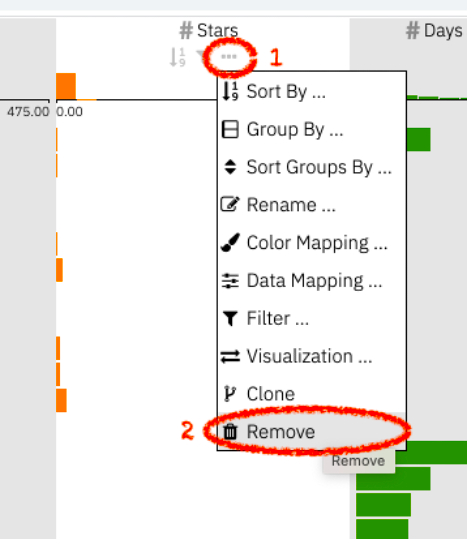
Above: a screenshot showing the two-step process of hiding a metric in the Open Source Software Nutrition Label.
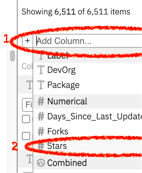
To show a previously hidden metric/column, move your mouse cursor to the sidebar located on the right-hand side of the Open Source Software Nutrition Label. Then click on the free text box titled Add Column, located next to the plus sign in the sidebar, and select the desired metric from the dropdown menu.
Package Dependencies: Neither Good nor Bad
Complexity, opacity, and dynamism are three defining characteristics of today’s package dependency landscape.
As we reflect on this project (and our parallel open source ecosystem analyses), we find it difficult to generalize across the various package dependency health metrics we explored. In our judgment, many Python and JavaScript packages in circulation today are fit for consumption — such as NumPy, pandas, and moment.js — providing real productivity benefits to the developers who rely on them. Others are more akin to junk food, momentarily enticing, both easy to ingest and neglect, but sub-optimal in the long term. (For instance, when analyzing one of our codebases, we came across a package dependency which serves as a “tombstone package.”) Finally, a few contain the software analogue of food contaminants, which compromise basic security and effectiveness, underscoring the need for more sophisticated open source software health metrics.
Much like the long, tortuous history of food labeling, the push for greater transparency around open source software and data science packages will likely involve many stakeholders working together over an extended period. The IQT Labs Open Source Software Nutrition Label prototype is one small attempt to demonstrate the art of the possible in this context. We believe the CHAOSS Project’s GrimoireLab, FOSSA, OpenSSF Scorecards, Moiva.io, Npmtrends, BundlePhobia, and CanIUse also offer intriguing ideas for analyzing and displaying this type of data.
Although our initial FakeFinder and Anaconda proofs-of-concept display project metadata derived from GitHub and Snyk Advisor, users are free to adapt the code for these prototypes to visualize different indicators for their codebases. (As IQT Labs’ prior data visualization work emphasizes, multiple quantitative metrics judiciously chosen and thoughtfully visualized can go a long way in helping analysts and decision-makers reason about uncertainty and risk.)
In addition to helping software engineering and data science teams explore the health of their codebases’ dependencies, we believe the easily digestible format of the Nutrition Label template could prove useful to those overseeing U.S. government open source software efforts, whether they are program managers looking to increase efficiency through software reuse or security assessment teams responsible for ensuring software integrity. By bringing together multiple types of open source software package metadata — for instance, Package Health Scores, Total Maintainers, and Days Since Last Release (described in our previous post) — in a single display, this interface should allow these users to identify potentially sub-optimal dependencies, much like IQT Labs did with the FakeFinder project.
Content and blog posts
To learn more about prior work that informed our analysis, please check out the following related blog posts:
- “Open Source Software Nutrition Labels: An AI Assurance Application,” IQT Blog, Jan. 2022
- “The Geography of Open Source Data Science: Mapping Anaconda Code Contributors,” IQT Blog, Nov. 2021
- “Can Open Source Code Steal Your Genome?” IQT Blog, Sept. 2021