

PCAPviz: Making Packet Capture Data More Accessible Through Visualization
Introducing a new tool from IQT Labs
PCAPviz is a user interface for packet capture (PCAP) analytics. Built as an integrated frontend for Packet Café, PCAPviz can be deployed in multiple environments, including your local machine. It helps system administrators identify devices on a network, review traffic encryption, and see port listening ranges.
How PCAPviz and Packet Café work together
IQT Labs is pleased to release PCAPviz, a visualization interface for Packet Café, an automated packet capture (PCAP) analysis platform.
PCAPviz and Packet Café are available as an integrated software package on GitHub. Both can be run locally at http://0.0.0.0/ and once you drag and drop a PCAP file into the application, PCAPviz gets to work bringing together the output of multiple Packet Café analytics in an easy-to-review visual dossier.
We designed PCAPviz to help network administrators answer three key questions:
- What devices are on my network (at a given point in time)? How confident am I this is the case?
- What percentage of my traffic is English language plaintext (indicative of unencrypted traffic)?
- What ports are sending traffic to/receiving traffic from a given device?
Why visualize packet capture data?
Since the “packet is the fundamental unit of information transport in all modern computer networks,” PCAP analysis is a critical capability for system administrators, security teams, and digital forensics investigators who typically work with large collections of captured packets. This process frequently requires context-switching across different tools and different levels of analysis. We built PCAPviz to reduce the friction involved.
PCAPviz organizes the output of the Packet Café analysis platform into an intuitive card- and icon-based interface, along with accompanying visualizations. Users can see a high-level overview displaying a PCAP timestamp, capture duration (in seconds), file size (in kB), and related packet statistics. From there, one can proceed to more detailed views of the data. Our premise is that this combination enhances Packet Café and makes several everyday PCAP analysis tasks less cumbersome and more efficient.
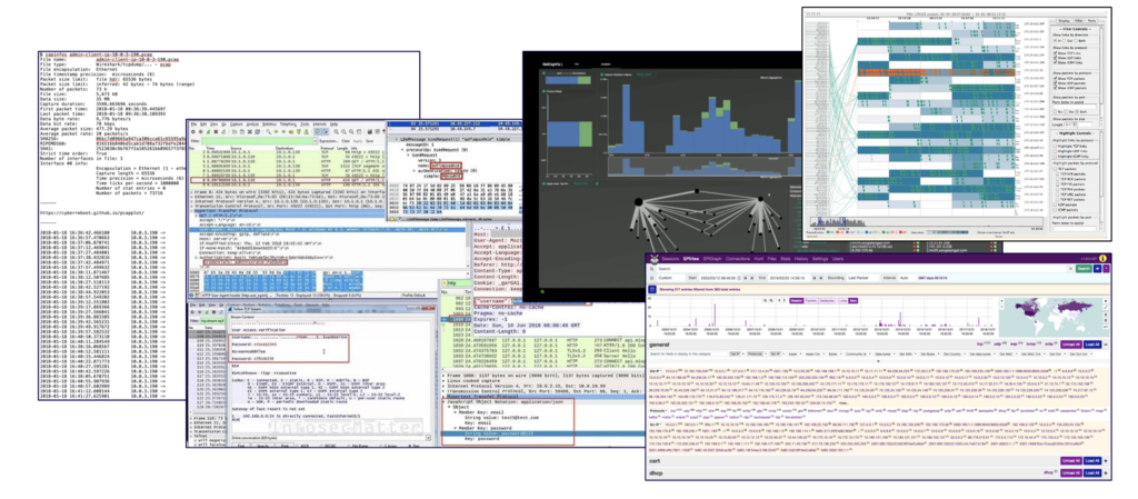
PCAPviz differs from many existing network analysis workflows in that it takes a device-centric approach to displaying PCAP outputs (rather than a more traditional protocol- or topology-based view of the data). It also differs in that existing packet capture visualization tools tend to be complex, with intricate protocol dissectors, multi-pane tabular displays, and force-directed graphs that sometimes make it challenging for administrators to spot security issues.
Along with interface complexity, today’s PCAP analytics have an added drawback in that they focus on deterministic features, such as operating system fingerprints, protocol tags, and round-trip time. Few existing tools generate hypotheses about device roles (e.g., printer vs. active directory controller), which can be difficult to infer. Fewer still display categorical uncertainty present in the data, which prior IQT Labs work explains, “arises when things are sorted into predefined categories and an attempt is made to quantify the probability of misclassifying something as the wrong type of thing.”
Having access to Packet Café enabled us to go beyond these limitations by taking advantage of an existing analysis capability called NetworkML, which performs device role identification and outputs multiple hypotheses about network devices, also known as endpoints. Using host- and session-level data, the underlying machine learning model infers each device’s functional role (e.g., printer or email server), which is an important element of piecing together a coherent picture of a PCAP.
Easy export and information sharing
To scope the initial set of features that would be most valuable to Packet Café users, we conducted nine key informant interviews with colleagues who work with PCAP data. This user research helped us identify common pain points, such as aggregating groups of devices and sharing findings with non-technical audiences.
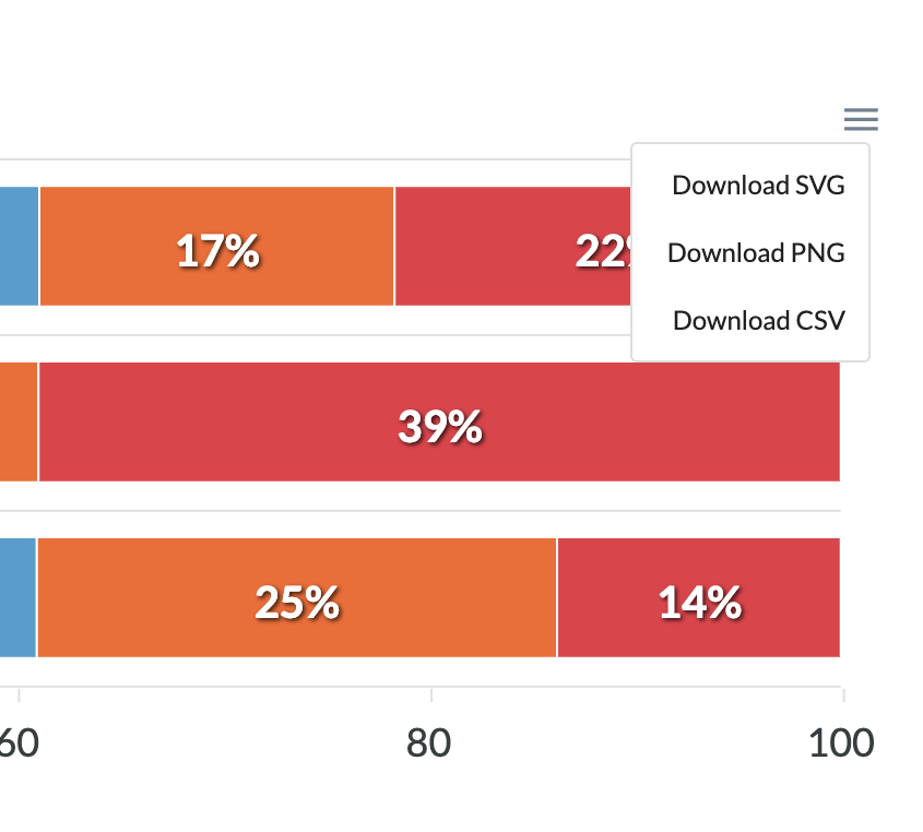
For this reason, PCAPviz enables users to export visualizations to share their findings with colleagues. The PCAPviz quick export tool is accessible through a collapsed menu icon (≡). It gives users three data format options: .svg and .png, which are widely used multimedia formats, and .csv, which enables further data analysis. This feature helps promote communication and eases the creation of incident reports, network security presentations, and digital forensics assessments.
PCAPviz features
Importantly, IQT Labs built PCAPviz to help users take advantage of the multiple analytics available in Packet Café. To see the this functionality in action, let’s upload a sample PCAP and see how the PCAPviz interface summarizes it.
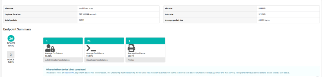
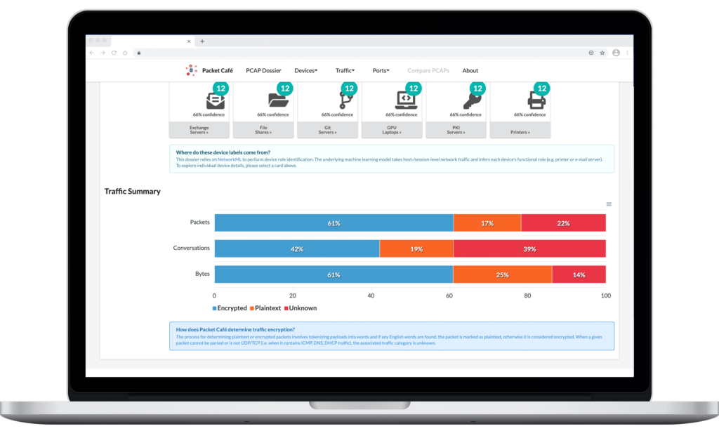
In the PCAPviz Endpoint Summary view above, each card represents a group of devices, or endpoints, that appear to share a similar role on the network. PCAPviz displays the total number of devices within each group in teal (in this case, 26 devices captured within smallFlows, the majority of which appear to be Developer Workstations). Users can then explore additional device details in the Device Summary by either clicking on a card or selecting the relevant device category from a dropdown menu that remains visible at the top of PCAPviz data views. Below is an example of the types of comparisons that PCAPviz makes possible.
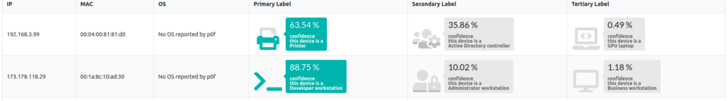
In the screenshot above, we see a device at the IPv4 address 192.168.3.99, which is either a printer or an Active Directory controller, or less likely, a GPU laptop. Given the potential for misclassification in this context, PCAPviz also provides categorical uncertainty data, displaying how confident NetworkML is in each device label.
In this case, the confidence label of 63.54%, and the corresponding iconographic fill rate under Primary Label, highlights the fact that Packet Café’s NetworkML module is almost 64% certain that the first device is, in fact, a printer. In considering the alterative hypotheses (Secondary and Tertiary label), we see that NetworkML assigns a 35.86% probability that the first device in the table above is an Active Directory controller (ADC) and a less than half of 1% probability it is a GPU laptop.
Categorical uncertainty arises when things are sorted into predefined categories and an attempt is made to quantify the probability of misclassifying something as the wrong type of thing.
2017 IQT Mission Challenge report
This is significant because these device types have little in common, highlighting the high degree of categorical uncertainty around this device so the user can investigate further and follow up appropriately. By comparison, the second device (a workstation at 173.178.118.29) in the table above has a lower level of associated uncertainty. Both the labels and fill rate displayed reflect that difference at a glance. At the bottom of the PCAPviz interface, the user can see additional traffic information in a series of adjacent visualizations (example below).
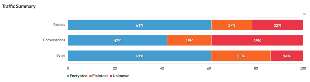
In the Traffic Summary view, PCAPviz presents the user with a simple bar chart that breaks down traffic into three categories (Encrypted, Plaintext, and Unknown). Packet Café determines whether a packet, traffic segment, or byte sequence is plaintext by tokenizing the packet header into words.
If Packet Café finds any English words, PCAPviz considers the data plaintext. Conversely, if Packet Café cannot parse a given packet or if the packet is not UDP/TCP (i.e. contains ICMP, DNS, or DHCP traffic), PCAPviz marks the associated traffic as unknown.
From there, the Traffic Summary visualization enables the user to compare results across three levels of analysis (packets within the PCAP; conversations, or traffic between two specific endpoints; and bytes within the packet header), export their results, and proceed to further analysis.
Try PCAPviz yourself
PCAPs provide rich snapshots of data traveling over networks. At the same time, PCAP analysis is a complicated sensemaking challenge compounded by multi-step workflows across deeply nested menus.
In building PCAPviz as an extension to Packet Café, we sought to consolidate multiple analytic outputs in a single graphical user interface (GUI) featuring linked views and easy export. Our aim was to apply two interface design principles — progressive disclosure (decluttering by layering) and recognition over recall (using icons for concreteness) — to help improve the usability of PCAP analytics, and we invite you to try it out for yourself.
PCAPviz and Packet Café are available as an integrated software package under the Apache 2.0 License. To start using PCAPviz (as well as the full range of analytics in Packet Café) on your own network capture data, make sure to review the prerequisites.
Interested in contributing to PCAPviz? Please check out the Packet Cafe code repo for more details.
Related posts
To learn more about prior IQT Labs research that informed our work on PCAPviz, please explore the following related blog posts:
- A Panoramic View of (One Small Slice) of Cybersecurity Data Science (Aug. 2020)
- Introducing Packet Café (May 2020)
- Analyzing & Visualizing Networks (Dec. 2019)
- Using Machine Learning to Classify Devices on Your Network (Apr. 2018)
👉 Alternatively, visit High Stakes Design to see older dataviz-related posts from IQT Labs.
Thank you to various colleagues, partners, and Packet Café end-users for thoughtful review and critique.