


IQT is known for pushing the boundaries of technology in domains that serve the national interest. Today, as we all struggle to make sense of the devastating effects of the novel coronavirus, we are increasingly aware of a growing need to help decision-makers interpret and communicate the meaning — and the usefulness — of emerging technological capabilities.
Today, IQT is announcing the release of the COVID-19 Diagnostic Accuracy Tool, an interactive web application designed to help people understand and interpret the accuracy of diagnostic tests for the novel coronavirus. This tool, built with Dash, uses interactive data visualizations to present quantitative information about uncertainty in accessible ways.
Epidemics — as we have all come to see first-hand — are full of uncertainty. Diagnostic test results are no exception. Some tests are more accurate than others due to specific characteristics of the test, and in some cases, it may be important to consider the trade-offs of various tests before deploying diagnostics to a population. Additionally, the accuracy of any test depends, in part, on estimates about the prevalence of infection, i.e., what percentage of people in the population actually have the disease. While knowing the true prevalence of infection is extremely difficult, statistical strategies can inform helpful estimates. It is important for decision-makers to understand these strategies and their limitations.
For several years, IQT’s B.Next has investigated ways to support effective communication of critical information during epidemics. Diagnostic tests are an essential source of information; test results can inform efforts to contain outbreaks, to support medical care, to inform decision-making about countermeasures, and to keep the public informed. However, for diagnostic test results to be useful and actionable, decision-makers must understand when — and to what extent — they can rely on the results. For this, they need to know how accurate diagnostic tests truly are.
What Does the COVID-19 Diagnostic Accuracy Tool Do?
The “About Performance” tab provides important background information on test accuracy, including explanations of key statistics such as sensitivity, specificity, positive predictive value (PPV), and negative predictive value (NPV).
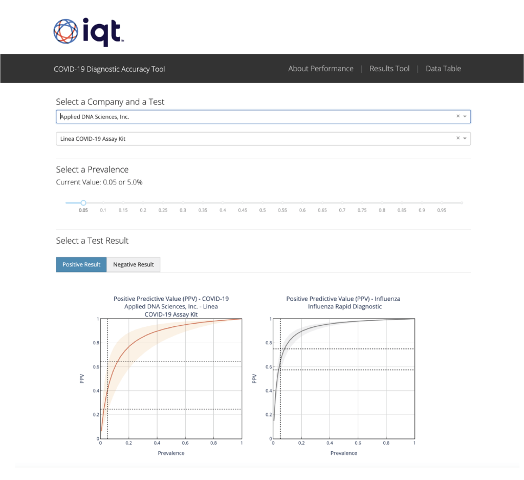
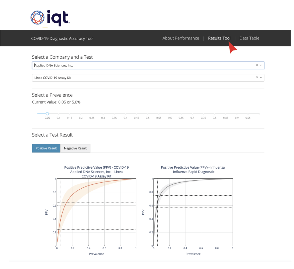
In the “Results Tool,” you can select a particular diagnostic test from a drop down menu and adjust a prevalence slider — either to reflect an estimated prevalence value or to explore various “what if” scenarios. Based on these inputs, you’ll see plots that reflect information about the accuracy of the selected test, given that level of infection prevalence.
The app also provides information about the accuracy of influenza tests as a comparison. We’ve included this as a reminder that even though no diagnostic is perfect, the information we do have can still be extremely useful.
****
Last week, I sat down with Zig Hampel-Arias, a data scientist in IQT Labs who built the interactive portion of the COVID-19 Diagnostic Accuracy Tool, using Dash.
Andrea: What is the benefit of building this type of data application? Why not just send decision-makers a slide presentation? Or give them access to the underlying database?
Zig: I’ve been a researcher for over a decade, but one problem that doesn’t ever seem to go away is conveying my work in a cogent format. When I was a graduate student, I realized that PowerPoint slides served their purpose during phone calls and meetings, but when colleagues missed the presentations, slides without the presenter weren’t enough. I even started quantifying this by keeping track of the number of offline emails they sent me, to request clarification or tell me I was wrong.
To help them understand my results, I started building analysis webpages in PHP and HTML. These contained sections and tabs outlining my hypotheses and assumptions, the experiment, and my final results. But these webpages still lacked real pizzazz. Don’t get me wrong, I cleverly adorned each section with relevant catstronauts, but they were still clunky. And they were a lot of work! I had to style and generate matplotlib figures offline and fight HTML to arrange the plots and calculations into a compelling narrative. But I kept at it, because ultimately, telling these data stories helped convey the value of my work.
Andrea: Sounds like a lot of engineering effort to show analysis results. How was building this application in Dash different?
Zig: Oh, it’s a world of difference. Now, all in Python, I can prop up an analysis page in a fraction of the time. What used to take me a week or two setting up and tweaking tables of image thumbnails, buttons to various pages and displaying LaTeX (!) now takes me a day in Dash.
Andrea: What specific features in Dash did you use to build the COVID-19 Diagnostic Accuracy Tool? Were any of them particularly helpful?
Zig: First, I like that there are numerous well-styled, freely available examples online. Dash has a set of default styles to choose from, but it’s also easy to design one’s own.
For people who use the COVID-19 Diagnostic Accuracy Tool, I think one of the most important features is that visitors to the Dash app can play with hyperparameters, test out assumptions on the data, and visualize the results immediately. Components like the slider bar make it easy for them to interact with the data — to change things up and see how that affects results.
For me, I appreciate that I can recycle my experimentation code, copy-pasting it directly into the page structure as supporting functions. This way, I don’t have to format and save a multitude of PNGs via matplotlib only to see that I cut off some data points and have to redo it all again.
Ultimately, I can only be effective as a researcher if I convey why my analysis work is important. This is key to building trust with end users and decision-makers, but also in collaborating with my colleagues. If I can share something like a Plotly-powered Dash app, then I don’t need to be present to back-up my claims. They can verify the results themselves!
****
The IQT COVID-19 Diagnostic Accuracy Tool Team:
Tommy Jones, Zig Hampel, Ryan Ashley, Kevin O’Connell, Chenny Zhang, Dylan George, Lu Borio, Victoria Chernow, Russ Ross, George Lewis, Andrea Brennen.
To learn more about IQT’s COVID-19 efforts, join this webinar on Sept. 23 and check out these links:
- IQT Covid Test Database GitHub
- Challenges of Interpreting Test Results and Implications for COVID-19
- COVIZ: Visualizing uncertainty in infectious disease forecasts
- B.Next Podcast: Visualizing Data During a Pandemic, with Plotly’s Nicolas Kruchten
- COVID-19 Case Investigation and Contact Tracing: Considerations for Using Digital Technologies
- IQT Tech-Enabled Contact Tracing and Privacy Roundtable Discussion
- To Fix the COVID-19 Testing Gap, Take a Lesson from GM (or the Pentagon)
To learn more about how Plotly is supporting COVID-19 efforts, check out these links:
- Podcast with Nicolas Kruchten about Plotly’s contribution to the OS community in COVID research.
- 18 DASH APPS HELPING THE HLS AND PUBLIC SECTORS RESPOND TO COVID-19
- Plot.ly Dash + RAPIDS | Census 2010 | COVID-19 Visualization (repo)
- Plotly and NVIDIA Partner to Integrate Dash and RAPIDS
Header image: “SWAB TEST,” created by Russell Tate, found on Unsplash.
Patient and medical supervisor preparing for a COVID-19 nasal swab test. Submitted for United Nations Global Call Out To Creatives — help stop the spread of COVID-19.